
Bulog
State‑Owned Enterprise
Brand Info
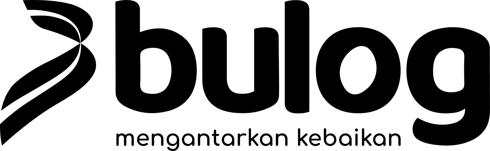
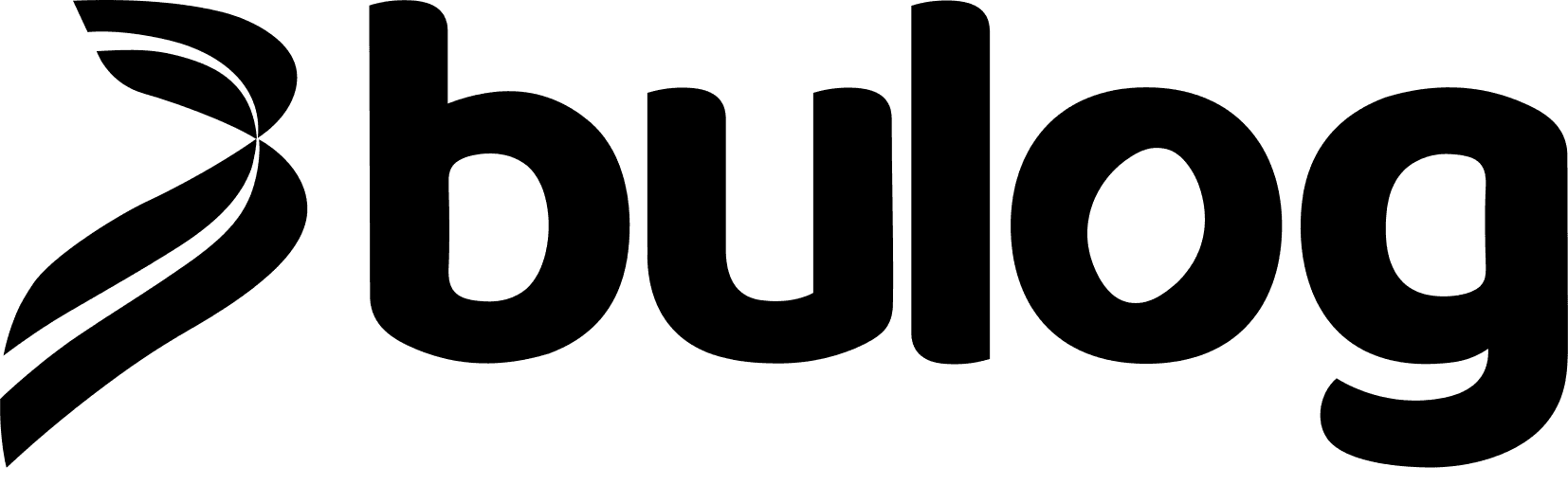
9+ Bulog Logo PNG & SVG Download


Bulog Brand Colors
About Bulog
Perum Bulog serves as the backbone of Indonesian food security, managing logistics and supply chains to ensure the nation’s pantry remains stable. With over 100 regional offices, the organization maintains a critical presence in every corner of the archipelago, acting as a steward of national welfare through strategic resource distribution.
"Mewujudkan ketahanan pangan yang berdaulat dan mandiri dengan menyediakan pangan berkualitas bagi seluruh rakyat Indonesia."
Meaning and History of the Bulog Logo
The Bulog logo represents more than just a state-owned enterprise; it is a seal of trust for millions of Indonesian households. While the exact historical origin of the initial Bulog symbol is rooted in mid-20th-century institutional design, the current Bulog logo has been refined to reflect a modern, efficient, and transparent logistics agency. The meaning of the Bulog logo is deeply intertwined with the concept of agricultural abundance and structural stability, often visualized through clean, geometric forms that denote professional reliability.
The Evolution of the Symbol
Tracing the history of the Bulog logo reveals a progression toward minimalism. Early iterations focused on heavy, utilitarian imagery, but as the agency matured, the visual identity shifted to emphasize connectivity. Today, the vector-based design represents a sophisticated entity that balances traditional values with modern logistical agility. Each redesign of the Bulog logo has aimed to simplify the emblem to ensure it remains legible across all scales, from small stationery items to massive warehouse signage across the country.
Design Elements & Typography
The typography associated with the Bulog logo is intentionally bold and sans-serif, communicating authority and clarity. Designers often look at the branding of major state institutions, noting that the Bulog typeface is crafted to evoke confidence and institutional permanence. The interplay between the iconic Bulog symbol and the corporate wordmark creates a cohesive visual identity that signifies strength, speed, and precision in the food distribution sector.
Bulog Color Palette
The Bulog logo utilizes a deliberate color palette to convey its core values. The deep navy blue represents the professional, serious nature of the government agency, while the vibrant gold reflects prosperity, high-quality agricultural products, and the golden harvest of Indonesia. These colors were chosen not just for aesthetic appeal, but to psychologically ground the brand in the public’s consciousness as a source of reliable nourishment. When analyzing the Bulog logo, one can see how these two tones create a high-contrast, memorable emblem that stands out in the competitive landscape of public-sector logistics.
Brand Impact
Ultimately, the branding of Bulog is a masterclass in institutional design. By maintaining a consistent visual identity, the organization has solidified its reputation as an essential pillar of Indonesia’s infrastructure. The meaning of the Bulog logo will continue to resonate as long as the organization fulfills its mandate, serving as a silent ambassador of stability and food security for every citizen.

