
Google Gemini
Artificial Intelligence
Brand Info
8+ Google Gemini Logo PNG & SVG Download


Google Gemini Brand Colors
About Google Gemini
Gemini represents the apex of Google's artificial intelligence research, standing as the flagship moniker for its generative AI capabilities. Formerly known as Bard, this comprehensive rebrand unifies Google’s vast ecosystem—from mobile assistants to high-compute cloud infrastructure—under a singular, powerful identity. As a multimodal intelligence capable of reasoning across text, images, code, and video, the brand visualizes the fluidity and complexity of modern neural networks. The visual identity signals a departure from playful internet search tools toward a sophisticated, autonomous agentic future.
“Gemini is the result of large-scale collaborative efforts by teams across Google, including our colleagues at Google Research. It was built from the ground up to be multimodal... generalizations and reasoning are native, not an afterthought.” — Sundar Pichai, CEO of Google
Meaning and History of the Google Gemini Logo
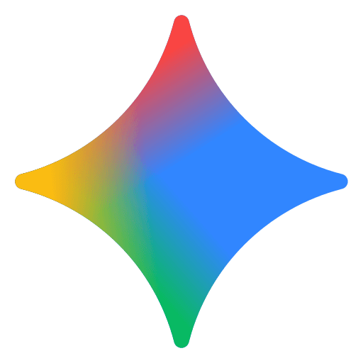
The Google Gemini logo is more than a mere corporate identifier; it is a visual metaphor for the duality and integration inherent in the model's architecture. The name "Gemini" itself references the Latin word for "twins," paying homage to both the Gemini constellation—associated with Castor and Pollux—and NASA's Project Gemini, which served as a bridge to the moon. In the context of the Google Gemini logo, this duality represents the collaboration between Google DeepMind and Google Research, as well as the model's ability to bridge human intent with machine execution.
When the branding transitioned from Bard to Gemini in early 2024, the visual identity shifted from a generic spark to a specific, proprietary emblem. This shift was necessary to distinguish the product in a saturated market of AI assistants. The design philosophy aims to capture the ethereal, intangible nature of thought processing, visualizing how an AI “hallucinates” creativity into reality.
The Evolution of the Symbol
While the brand is relatively young, the evolution of its visual identity tells a story of rapid technological maturity. The precursor, Bard, utilized two simple stars, often rendered in the standard Google primary colors. However, the introduction of the Google Gemini symbol marked a sophisticated turn. The current icon is often described as a “quantum sparkle” or a fluid star.
Unlike a static vector graphic, the Gemini icon is frequently animated in digital applications, showcasing a morphing, liquid state. This implies that the intelligence is never static; it is constantly learning, adapting, and flowing between different modes of information. The symbol retains the four-pointed star structure common in AI iconography (representing a spark of an idea) but elevates it with gradients that suggest depth and dimension, moving away from flat design trends.
Design Elements & Typography
The typography accompanying the Google Gemini logo utilizes Google Sans, the company's proprietary geometric sans-serif typeface. This maintains consistency with the broader Google ecosystem while allowing the symbol to take center stage. The weight used is typically substantial, projecting authority and stability amidst the fluidity of the icon.
The shape of the emblem is particularly fascinating. It balances soft curves with sharp terminals, suggesting a blend of organic human conversation and precise machine logic. Designers looking for the meaning behind the shape will note its symmetry, which reinforces the concept of the “twin” architecture—two sides (input and output, or DeepMind and Research) working in perfect harmony.
Google Gemini Color Palette
The Google Gemini logo departs from the primary Blue, Red, Yellow, and Green of the parent company, opting instead for a mystical, ethereal palette. The specific hex codes utilized create a gradient that feels futuristic and synthetic.
The palette blends cool intellectual blues with creative violets and grounding teals. This spectrum is critical to the branding, as it visually communicates the “multimodal” nature of the engine—it isn't just one thing; it is a spectrum of capabilities. The use of “Deep Learning Lavender” and “Quantum Blue” suggests a tool that operates in the cloud, handling complex reasoning tasks that feel almost magical to the end user.
Brand Impact
In the fiercely competitive landscape of generative AI, the Google Gemini logo has quickly become a recognizable seal of advanced capability. Whether displayed on the “Nano” on-device version or the high-throughput “Flash” variants, the branding successfully conveys a unified, premium tier of technology. It effectively sheds the experimental baggage of the "Bard" era, positioning Google not just as a participant in the AI race, but as the architect of its future.
