
Halal Indonesia
Government Agency
Brand Info
4+ Halal Indonesia Logo PNG & SVG Download

Halal Indonesia Brand Colors
About Halal Indonesia
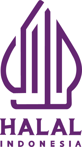
The Halal Indonesia logo serves as the definitive seal of assurance for Muslim consumers across the archipelago and beyond, signifying that products meet the strict religious dietary standards of Islam. Managed by the Halal Product Assurance Organizing Agency (BPJPH) under the Ministry of Religious Affairs, this visual identity marks a pivotal shift in how certification is presented in the world's most populous Muslim nation. It represents not just religious compliance, but a bridge between spiritual purity and national cultural heritage.
"Halal (permissible) is distinct from Haram (forbidden), and the new visual identity reflects a harmony between religious obligation and Indonesian wisdom, ensuring products are both Halal and Thayyib (good and wholesome)."
Meaning and History of the Halal Indonesia Logo
The introduction of the new Halal Indonesia logo in 2022 marked a significant historical transition in the nation's certification process. Previously, the certification label was administered by the Indonesian Ulema Council (MUI); however, the new mandate places the authority under the state-run BPJPH. The design philosophy was crafted to reflect distinct Indonesian characteristics, moving away from generic Middle Eastern aesthetics to embrace "Nusantara" (archipelago) culture.
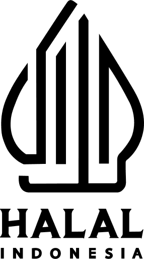
The meaning of the Halal Indonesia logo is deeply rooted in Javanese philosophy. The primary shape is a stylization of the Arabic word for Halal (حلال), ingeniously crafted to resemble a Gunungan. In traditional Wayang (shadow puppetry), the Gunungan symbolizes the universe, life, and the connection between the human and the divine. By adopting this silhouette, the Halal Indonesia symbol asserts that religious observance can coexist beautifully with local tradition. The pointed top of the Gunungan represents human aspiration toward the Creator, while the stable base signifies the solid foundation of religious law in daily life.
The Evolution of the Symbol
For decades, the visual landscape of halal products in Indonesia was dominated by the circular, green MUI emblem. That design was functional and widely recognized, utilizing standard Islamic calligraphy and the color green, which is traditionally associated with Islam. The evolution toward the current Halal Indonesia logo represents a bold modernization of the nation's branding.
This change was not merely aesthetic but structural, signaling the government's direct involvement in guaranteeing product safety. While the old emblem focused strictly on the textual declaration of "Halal," the new visual identity incorporates abstract artistry. The transition has sparked conversation regarding the legibility of the Kufic-style Arabic script, yet it has successfully established a unique national brand that stands apart from the generic circular stamps used by halal certifiers in other countries.
Design Elements & Typography
Designers and typographers analyzing the Halal Indonesia logo will notice a sophisticated use of positive and negative space. The emblem does not use a standard commercial font; rather, it utilizes a custom stylized calligraphy. The strokes of the Arabic letters Ha, Lam, and Alif are distorted to mimic the intricate patterns of a Surjan (traditional Javanese striped coat).
- The Shape: The conical Gunungan silhouette is the dominant feature, providing a strong, vertical presence that works well as a scalable vector on packaging ranging from small candy wrappers to large shipping containers.
- The Calligraphy: The Arabic script is highly stylized, bordering on abstract. This artistic choice emphasizes the integration of culture over literal legibility, requiring the viewer to recognize the shape as a holistic icon rather than reading the text linearly.
- The Text: Below the icon, the text "HALAL INDONESIA" is usually printed in a clean, sans-serif typeface to ensure clarity and offset the complexity of the artistic emblem.
Halal Indonesia Color Palette
A striking departure from the conventional greens found in Islamic branding, the Halal Indonesia logo utilizes a rich purple hue. In the context of this branding, the color represents dignity, creativity, and spiritual depth. While green is often expected in religious sectors, this specific purple helps the certification mark stand out on crowded supermarket shelves where green is already overused by nature-centric food brands.
The specific hex code utilized creates a sense of royalty and premium assurance. This unique color choice reinforces the "Halal Thayyib" concept—implying that the product is not only permissible but of high quality.
Brand Impact
The launch of this identity has centralized the halal guarantee system in Indonesia. By creating a distinct, culturally integrated emblem, the BPJPH has successfully claimed ownership of the certification process. The Halal Indonesia logo is now the mandatory standard, acting as a beacon of trust for millions of consumers who seek spiritual peace of mind in their daily consumption.

