
Indah Cargo
Logistics & Delivery
Brand Info
3+ Indah Cargo Logo PNG & SVG Download
Indah Cargo Brand Colors
About Indah Cargo
Indah Logistik, widely recognized as Indah Cargo, is a titan in the Indonesian logistics sector. Driven by a mission to bridge geographical divides through seamless distribution, the brand symbolizes connectivity across the archipelago.
"Memberikan energi untuk terus berlari cepat dengan ketepatan waktu, keamanan, dan informasi yang terpercaya."
Their dedication to efficiency has cemented their status as a world-class shipping service.
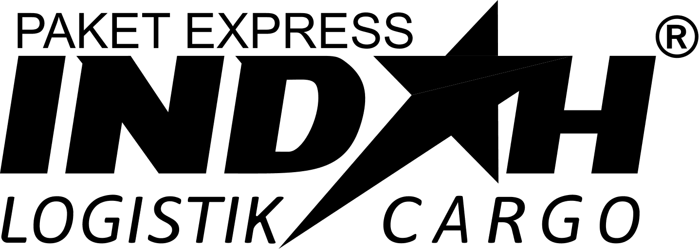
Meaning and History of the Indah Cargo Logo
The Indah Cargo logo serves as a beacon of reliability for businesses across Indonesia. While the company was founded in 2011, the Indah Cargo logo emerged as a visual shorthand for the company’s vast network of 519 branches. From a design history perspective, the Indah Cargo symbol was conceptualized to communicate speed and professional trust. The history of the Indah Cargo logo is deeply intertwined with the vision of its founder, H. Arisal Aziz, who sought to create a visual identity that would resonate with both urban enterprises and rural communities from Sabang to Merauke.
The Evolution of the Symbol
Initially, the brand identity focused on establishing physical presence. As the company grew to include over 1,800 operational vehicles, the branding evolved to reflect a more robust, multi-service operation. Designers refined the emblem to represent not just traditional trucking, but also air and sea logistics. Today, the Indah Cargo logo stands as a mature mark of industrial power, serving as an iconic vector that signifies rapid movement and logistics expertise.
Design Elements & Typography
The meaning behind the design lies in its bold, geometric stability. The typography is chosen for maximum legibility, ensuring that it remains sharp even when printed on fleet vehicles or high-resolution digital media. The balance within the Indah Cargo symbol reflects the logistical harmony required to manage such a complex delivery network. Every line and curve in the Indah Cargo logo is engineered to convey the company's commitment to punctuality and safety in an increasingly competitive marketplace.
Indah Cargo Color Palette
The color strategy is fundamental to the brand's psychological impact. The palette is comprised of three distinct hues, each serving a strategic purpose:
- Deep Maritime Blue (#003B5F): Acting as the primary anchor, this color signifies the company's deep-rooted authority and global-class professionalism in sea and air freight.
- Terracotta Earth (#C08040): Used as a secondary tone, this shade highlights the brand's expansive land-based trucking capabilities and its connection to the Indonesian landscape.
- Energy Gold (#FFC000): As an accent color, this represents the speed, vitality, and the "energy to run fast" that is central to the company’s operational ethos.
Brand Impact
Ultimately, Indah Cargo has successfully transformed its logo into a national institution. By maintaining a consistent visual identity, the brand ensures that customers immediately associate their parcels with safety, speed, and integrity. Their evolution proves that a well-designed vector graphic is more than just an image; it is the heartbeat of a logistical empire.