
Lazada
Marketplace
Brand Info
8+ Lazada Logo PNG & SVG Download


Lazada Brand Colors
Lazada Typography
About Lazada
As a pioneering force in the ever-changing world of eCommerce, Lazada has revolutionized the way Southeast Asia shops and sells. By focusing on evolving technology, logistics, and a secure payments infrastructure, the platform provides a safe and enjoyable online shopping experience. From empowering small retailers to become super eBusinesses to offering an endless array of goods, Lazada operates extensively across Indonesia, Vietnam, Malaysia, Thailand, Singapore, and the Philippines.
"Our mission is to accelerate progress in Southeast Asia through commerce and technology, fostering an ecosystem where businesses and shoppers can thrive together."
Meaning and History of the Lazada Logo
When investigating the precise meaning of Lazada logo design, one must delve into the brand's fast-paced origins. Launched in 2012, Lazada initially utilized a straightforward, utility-driven visual identity intended to establish basic trust in a nascent online market. The early history of Lazada logo aesthetics showcased a basic blue and orange wordmark that got the job done but lacked deeper emotional resonance. As the company grew into an undisputed industry leader, the brand required an overhaul to reflect its dynamic, customer-centric philosophy. In 2019, the company unveiled a complete redesign. The modern emblem communicates an inviting, high-energy environment, demonstrating that online shopping is an engaging, lifestyle-enhancing experience.
The Evolution of the Symbol
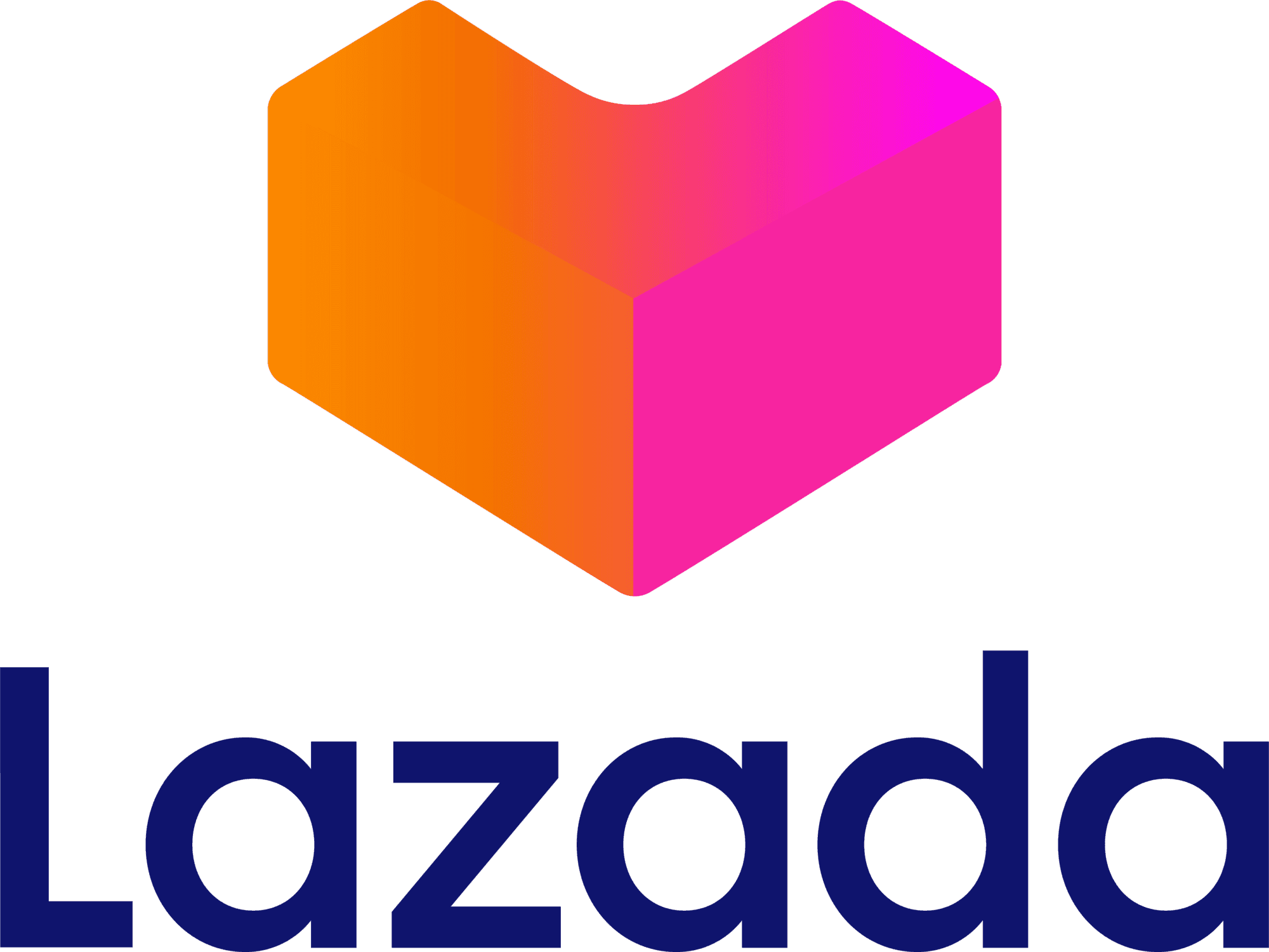
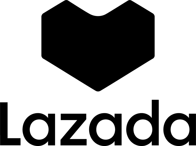
The transition from a static wordmark to a versatile, modern Lazada logo marks one of the most successful rebrands in the region. In its early days, the brand relied on a conservative logotype that prioritized basic legibility. However, as mobile commerce exploded, the company needed a distinct Lazada symbol that could thrive on compact screens and app drawers. The pivotal 2019 rebrand introduced the now-iconic Heartgram. This three-dimensional emblem masterfully blends the letter "L" with a heart shape, illustrating the brand's profound commitment to customer satisfaction. Transforming from a flat font into a vibrant, multi-dimensional vector file, the new branding signaled a turning point in Lazada's global trajectory.
Design Elements & Typography
The current visual identity is built upon geometric precision, fluidity, and modern approachability. The branding incorporates several key components:
- The Heartgram Emblem: A vibrant vector graphic that conveys a distinct sense of motion, agility, and innovation.
- Custom Typography: An exceptionally clean, rounded sans-serif font engineered for maximum digital scalability.
- Harmonious Geometry: Soft, rounded corners complement the energetic, slanted angles of the primary icon.
By blending a three-dimensional box—representing logistics and commerce—with a subtle heart motif, the design encapsulates the joy of receiving a package. Every individual curve in the emblem is meticulously calibrated to ensure the mark remains crisp, whether printed on delivery trucks or scaled down as an app icon.
Lazada Color Palette
Color serves as a foundational pillar for the brand's visual system, dramatically shaping its overall perception and emotional appeal. The overarching palette is characterized by a bold, fluid gradient of warm, energetic hues that are securely anchored by a deep, authoritative blue. These colors purposefully represent the rich, vibrant diversity of the Southeast Asian markets. The dark navy tone signifies unshakeable security, technological prowess, and reliability in financial transactions. In striking contrast, the fiery gradient—comprising magenta, vibrant orange, and bright coral—embodies the passion, excitement, and sheer energy of the modern retail revolution.
Brand Impact
Today, the Lazada logo is more than a corporate trademark; it is a cultural staple in Southeast Asian digital commerce. The profound meaning behind the visual identity resonates with millions of daily users, fostering enduring trust. By adapting its branding to the demands of modern consumers, Lazada maintains its prominent position at the forefront of the retail revolution, confidently shaping the future of eCommerce.
