
Kementerian Pertanian RI
Ministry
2+ Kementerian Pertanian RI Logo PNG & SVG Download
Kementerian Pertanian RI Brand Colors
About Kementerian Pertanian RI
Kementerian Pertanian Republik Indonesia (Ministry of Agriculture of the Republic of Indonesia) stands as the guardian of the nation's food sovereignty and the primary architect behind the welfare of its farming communities. As a pivotal government institution, it is tasked with the immense responsibility of managing the vast agrarian resources of the archipelago, ensuring food security, and driving the modernization of cultivation methods. From horticulture to animal husbandry, the ministry orchestrates a complex ecosystem designed to elevate productivity and sustainable infrastructure. At the heart of its public image lies a distinct visual identity that commands respect and symbolizes the fertility of the Indonesian soil.
"To realize a dignified, independent, and modern agriculture for the welfare of farmers." – Mission of Kementerian Pertanian RI
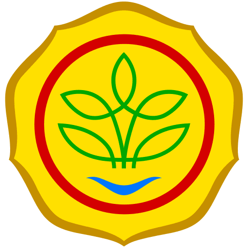
Meaning and History of the Kementerian Pertanian RI Logo
The Kementerian Pertanian RI logo is more than a mere administrative seal; it is a profound representation of the nation's agrarian philosophy, often summarized by the Javanese adage "Gemah Ripah Loh Jinawi" (prosperous and fertile land). Historically, the branding of Indonesian government bodies relies heavily on heraldry that communicates duty, nationalism, and specific sectoral focus. The meaning behind this emblem is deeply rooted in the concept of life-sustaining resources.
The logo typically features a stylized sprout or plant encircled by golden rice elements, which are quintessential to Indonesian culture as the staple food source. This imagery signifies the ministry's core mandate: to ensure that the nation is fed and that the agricultural sector remains the backbone of the economy. Over the decades, while the core philosophy has remained unchanged, the interpretation of the Kementerian Pertanian RI logo has solidified its status as a beacon of stability for millions of farmers across the islands.
The Evolution of the Symbol
Unlike commercial brands that undergo radical rebrands to suit trends, government insignias like the Kementerian Pertanian RI logo evolve subtly to maintain authority and recognition. Early iterations of the ministry’s visual identity were often intricate, hand-drawn seals used primarily for official stamping and paper documentation. These versions were heavy on detail but difficult to reproduce in smaller formats.
As the ministry moved towards the digital age and the goal of "Agricultural Modernization," the emblem was refined. The current iteration retains the classic heraldic elements but utilizes cleaner lines and standardized colors suitable for digital media, websites, and mobile applications. This transition to a cleaner vector format ensures that the symbol remains legible whether it is displayed on a massive billboard in a rural district or a smartphone screen in Jakarta, reflecting the ministry's commitment to technological integration.
Design Elements & Typography
The anatomy of the Kementerian Pertanian RI logo is a masterclass in symbolic density. The central focal point is usually a representation of water and plant life, symbolizing the harmony between irrigation and cultivation. Enclosing this is often a circular or pentagonal border—the latter frequently representing the Pancasila, Indonesia's foundational philosophical theory. The use of a rice stalk (padi) and sometimes cotton (kapas) in the design is a classic Indonesian motif representing social justice and prosperity—specifically, the availability of food and clothing for all citizens.
Typography plays a crucial role in grounding the emblem. The font used for "KEMENTERIAN PERTANIAN REPUBLIK INDONESIA" is typically a bold, sans-serif or slab-serif typeface. This choice projects strength, stability, and bureaucratic authority, ensuring the text is readable and authoritative. The text usually arcs around the graphic element or sits firmly beneath it, creating a balanced, official seal that conveys trust.
Kementerian Pertanian RI Color Palette
The color scheme of the Kementerian Pertanian RI logo is strictly purposeful, avoiding arbitrary trends in favor of colors that hold deep national and natural significance. The palette is dominated by earth tones and national colors that evoke the spirit of the land.
- Agrarian Green: The dominant hue representing the lush landscapes of Indonesia, fertility, and the growth of crops. It anchors the brand in nature.
- Harvest Yellow: A bright, optimistic yellow that symbolizes the rice harvest, sunshine, and the golden promise of food sovereignty.
- Sovereign Amber: Used for detailing and depth, this darker gold tone adds a sense of prestige, history, and the value of agricultural commodities.
- Archipelago Red: A nod to the national flag (Sang Saka Merah Putih), representing courage, energy, and the burning spirit of the farmers to sustain the nation.
Brand Impact
In conclusion, the Kementerian Pertanian RI logo successfully encapsulates the ministry's dual mission of tradition and modernization. It serves as a visual guarantee of quality and support for the agricultural community. By maintaining a consistent and meaningful visual identity, the ministry ensures that its initiatives are instantly improving the perceived value of Indonesian agriculture. Whether stamped on fertilizer sacks or displayed at international summits, the logo stands as a proud testament to Indonesia's identity as a global agricultural powerhouse.

