

Slack
Software & SaaS
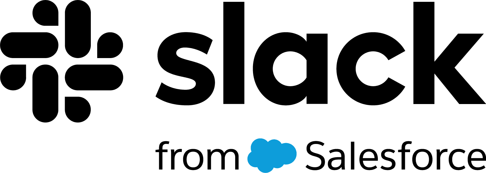
Slack Logos & Assets8


Slack Brand Colors
Slack Typography
About Slack
Slack has fundamentally redefined the landscape of corporate communication, evolving from a simple internal tool for a gaming company into the world's leading digital headquarters. As a titan in the Technology sector, Slack (an acronym for "Searchable Log of All Conversation and Knowledge") facilitates seamless collaboration through channels, replacing the cluttered inefficiency of traditional email. The brand's philosophy is rooted in transparency, playfulness, and human-centric design, creating a platform where productivity meets personality.
"Make work life simpler, more pleasant and more productive." – Slack Mission Statement
Meaning and History of the Slack Logo
The Slack logo has become one of the most recognizable emblems in the software industry, symbolizing the intersection of communication and collaboration. The original visual identity, launched with the company in 2013, featured a hashtag (or "octothorpe") composed of 11 distinct colors. It was designed to represent the "channels" organization structure that defines the platform. However, the meaning of the Slack logo evolved significantly in 2019.
Recognizing the need for a more cohesive system, Slack partnered with Pentagram, led by partner Michael Bierut, to redesign the brand identity. The goal was to retain the spirit of the original branding while correcting its flaws—specifically, the original logo's inability to scale well or look correct on different colored backgrounds. The new emblem strips away the complexity, resulting in a cleaner, more versatile mark that represents separate distinct parts coming together to form a unified whole.
The Evolution of the Symbol
The evolution of the Slack symbol is a masterclass in brand maturity. The 2013 iteration was playful but graphically difficult; it utilized a specific 18-degree rotation and a "plaid" intersection of colors that created muddiness when printed or rendered at small sizes. It lacked the geometric precision required for a modern vector icon.
The 2019 refresh introduced a simplified octothorpe constructed from four speech bubbles and four lozenges (or "teardrops"). This evolution was not merely aesthetic but functional. The distinct shapes imply two people talking or a loop of information, reinforcing the concept of dialogue. This new emblem eliminated the transparency effects of the previous version, allowing the logo to stand boldly on any background without losing its definition.
Design Elements & Typography
From a design historian's perspective, the current visual identity strikes a balance between corporate reliability and human warmth. The logo is constructed using basic geometric primitives—circles and rounded rectangles—which convey friendliness and accessibility. The teardrop shapes suggest location pins or commas, subtly referencing the tools of digital work.
The typography accompanying the icon is set in Larsseit, a contemporary grotesque sans-serif font. It is highly legible and neutral, allowing the colorful icon to take center stage. The bold weight of the wordmark provides a solid foundation for the energetic symbol, grounding the playful shapes in professional stability.
Slack Color Palette
The Slack logo utilizes a refined palette reduced from the original eleven colors to four primary hues plus a signature deep purple. These colors—blue, green, yellow, and red—are not random; they are calibrated to evoke the primary colors of printing and screen displays, symbolizing universality.
The signature background color, a deep Aubergine, serves as a high-contrast canvas that makes the bright pops of the logo vibrate with energy. This color scheme has become synonymous with the brand, differentiating it from the stark white or blue interfaces of competitors like Microsoft Teams. Each color in the lozenge design works to guide the eye in a circular motion, suggesting continuity and infinite workflow.
Brand Impact
Today, the Slack brand stands as a paragon of modern software identity. By pivoting from a chaotic, multicolored hash to a refined system of speech bubbles, the company successfully matured its image without losing its soul. The resulting visual system is adaptable across all media, from mobile app icons to massive billboard advertisements, solidifying Slack's position not just as a tool, but as a vital ecosystem for the modern workforce.