
Telkomsel
Mobile Network Operator
11+ Telkomsel Logo PNG & SVG Download

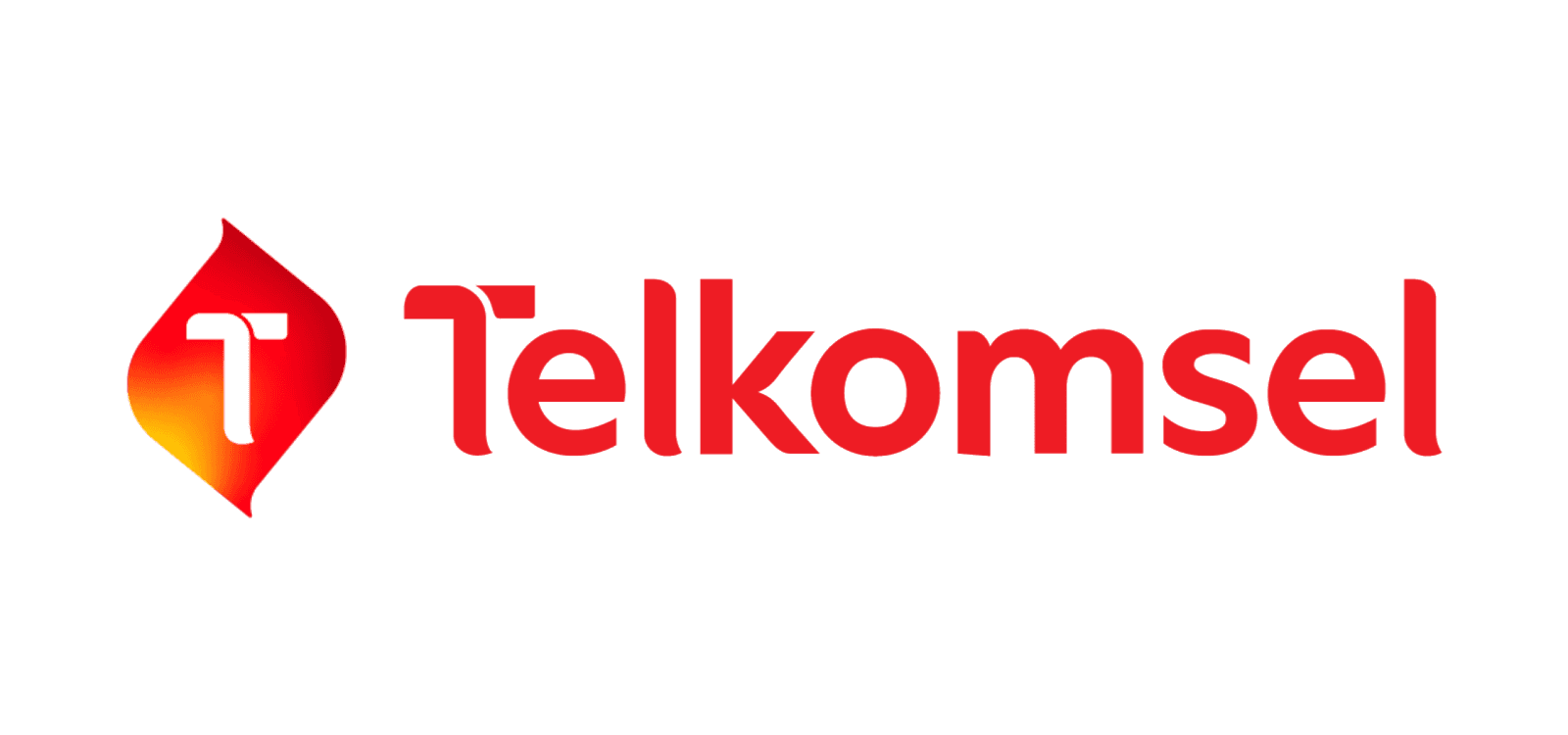

Telkomsel Brand Colors
Telkomsel Typography
About Telkomsel
Established in 1995 as a subsidiary of PT Telekomunikasi Indonesia Tbk, Telkomsel is the leading telecommunications operator in Indonesia. Headquartered in Jakarta, the brand has consistently provided extensive network coverage and innovative digital solutions, from mobile broadband to IoT services, empowering millions of users across the archipelago.
"To open up a world of more by delivering reliable and efficient digital experiences to every corner of Indonesia."
Meaning and History of the Telkomsel Logo
To truly understand the meaning of Telkomsel logo designs throughout the years, one must look at Indonesia's rapid technological adoption. The history of the Telkomsel logo is deeply rooted in both cultural heritage and continuous innovation. Established as a joint venture with Singtel and Telkom Indonesia, its early visual identity was designed to convey nationwide connectivity and reliability. The meaning behind the original Telkomsel logo was intricately tied to traditional Indonesian elements, subtly incorporating motifs that signified global communication capabilities while maintaining a distinctly local essence that resonated with millions of early mobile phone adopters.
The Evolution of the Symbol
Over the last few decades, the Telkomsel symbol has undergone significant transformations to reflect its shift into a modern, digital-first enterprise. Early iterations of the Telkomsel logo were notably complex, heavily relying on the corporate blue, grey, and yellow hues characteristic of its parent organizations. As the telecommunications landscape evolved—especially with Telkomsel spearheading the introduction of 4G LTE technology and mobile broadband—the emblem needed to adapt. In 2021, the company launched a comprehensive rebranding initiative. This overhaul shed the heavy legacy corporate baggage, transforming the visual identity into a dynamic, futuristic graphic that better aligns with today's fast-paced digital ecosystem.
Design Elements & Typography
The contemporary visual identity of Telkomsel is defined by its bold simplicity and highly accessible design language. Designed to function flawlessly as a scalable vector graphic across countless smart devices and digital applications, the modern emblem utilizes a custom sans-serif typeface. This specific branding choice was made to appear approachable yet highly professional. Key design elements include:
- Custom Typography: The bespoke, lowercase-heavy font feels incredibly energetic, mirroring the brand's pivot towards youth-oriented digital products, mobile financial services, and entertainment content.
- The Portal Motif: The new branding frequently integrates curved, abstract shapes reminiscent of a portal, which serves as a powerful metaphor for opening up new digital opportunities and IoT (Internet of Things) solutions.
- Streamlined Minimalism: By stripping away the overly intricate patterns of the 1990s, the current design allows the core message of seamless connectivity to take center stage.
Telkomsel Color Palette
A cornerstone of the 2021 branding update was the adoption of a vibrant, unifying primary color, deliberately shifting away from the fragmented, multi-colored palette of the past. The contemporary Telkomsel logo is powerfully anchored by a single, striking shade of red.
- Telkomsel Crimson (#FF0040): This bold and highly energetic red signifies passion, courage, and a pioneering spirit. It guarantees maximum visibility in competitive advertising spaces and perfectly encapsulates the brand's unyielding commitment to pushing boundaries within the telecommunications sector.
Brand Impact
Today, the profound meaning embedded within the modernized Telkomsel logo goes far beyond simple telecommunications; it stands as a universal beacon of digital empowerment across Southeast Asia. By successfully refreshing its visual identity, Telkomsel has reinforced its dominant market position and fostered deeper connections with a younger generation of digital natives. As it continues to partner with international players like the Bridge Alliance, this dynamic emblem consistently inspires consumer trust, ultimately representing a seamless, unwavering connection across the vast and beautifully diverse Indonesian archipelago.