
Wahana Express
Logistics & Delivery
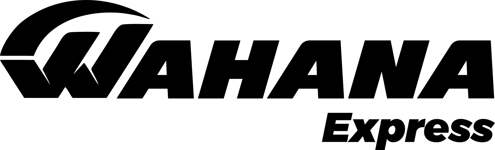
6+ Wahana Express Logo PNG & SVG Download


Wahana Express Brand Colors
Wahana Express Typography
About Wahana Express
Established in 1998, PT. Wahana Prestasi Logistik has cemented its position as a cornerstone of the Indonesian delivery ecosystem. By providing affordable, efficient, and friendly services through Wahana Express, Logistics, and Commerce, the company serves as a vital bridge for local businesses.
"Melayani Negeri dengan Hemat, Cepat, dan Bersahabat."
Their commitment to bridging the archipelago defines their ongoing legacy in the logistics sector.
Meaning and History of the Wahana Express Logo
The Wahana Express logo represents more than just a delivery service; it is a mark of reliability built over two decades. While the company began as a modest operation, the Wahana Express symbol was designed to communicate speed and accessibility. Designers aimed to create a visual identity that felt both institutional and approachable. When analyzing the meaning of the Wahana Express logo, one uncovers a philosophy centered on moving commerce forward. For design historians, the history of the Wahana Express logo reflects the transition from a traditional courier service to a sophisticated 4.0 industry player.
The Evolution of the Symbol
Throughout its history, the brand has maintained a consistent branding trajectory. While the original iteration focused on basic legibility, modern iterations of the Wahana Express logo have been optimized for digital platforms. Whether used as a vector file for large-scale warehouse signage or a tiny mobile app emblem, the mark remains instantly recognizable. The history of the Wahana Express logo highlights a move toward simplification, stripping away unnecessary clutter to emphasize the core brand name, ensuring it thrives in a high-speed digital market.
Design Elements & Typography
The typography within the Wahana Express logo utilizes bold, clean sans-serif letterforms that suggest movement and momentum. The geometric structure of the Wahana Express symbol is engineered for high contrast and scalability. By maintaining a clean visual identity, the company ensures that their vector assets remain sharp across all touchpoints, from delivery trucks to packing labels. Every curve in the emblem is intentional, signaling that the company is built upon precision and technological advancement.
Wahana Prestasi Logistik Color Palette
The color theory behind the brand is anchored by two dominant tones. The deep blue represents trust, corporate integrity, and the vast networks the company covers. The vibrant red serves as the accent, injecting a sense of urgency, speed, and energy—essential traits for any successful logistics provider. These colors work in tandem to balance the seriousness of logistics operations with the dynamic, fast-paced nature of e-commerce support, creating a distinct visual hierarchy in the logistics marketplace.
Brand Impact
Today, the meaning of the Wahana Express logo is synonymous with the growth of Indonesia’s SME sector. By evolving its branding to meet the demands of Industry 4.0, Wahana continues to secure its spot as a household name. As the company looks toward the future, its refined visual identity will undoubtedly remain a guiding light for efficient, reliable, and accessible distribution services across the nation.