
Pertamina
State‑Owned Enterprise
Brand Info
9+ Pertamina Logo PNG & SVG Download


Pertamina Brand Colors
About Pertamina
PT Pertamina (Persero) stands as the colossal backbone of Indonesia’s national energy sector, managing the entire oil and gas supply chain from upstream exploration to downstream distribution. As a state-owned enterprise responsible for the energy security of the world's largest archipelago, Pertamina’s visual presence is ubiquitous across the nation. The company has evolved from a bureaucratic monopoly into a competitive, world-class energy player, a transformation deeply reflected in its modern branding strategies. The current Pertamina logo is more than a corporate identifier; it is a symbol of national pride and dynamic progress.
“Energizing You.” — Pertamina Brand Promise
Meaning and History of the Pertamina Logo
The history of the Pertamina logo is a tale of two distinct eras: the era of monopoly and the era of open competition. For decades, the company operated under the "Kuda Laut" (Seahorse) emblem, which represented the company's maritime dominance and old-world bureaucratic values. However, in 2005, to mark its transformation into a profit-oriented, competitive business entity, Pertamina unveiled a radical rebranding.
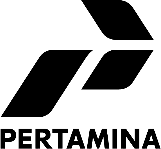
Designed by the renowned global consultancy Landor Associates, the modern Pertamina logo abandoned the literal illustration of seahorses for an abstract, geometric "P" shape. This shift was strategic, signaling a departure from rigid state administration to a flexible, customer-centric corporate culture. The design philosophy centers on the concept of "always moving forward," utilizing arrow-like shapes to suggest momentum, innovation, and the drive to secure sustainable energy for the future.
The Evolution of the Symbol
The transition from the 1968 emblem to the current visual identity represents one of the most significant corporate rebrands in Southeast Asian history. The original logo featured two red seahorses flanking a yellow star on a blue shield. While patriotic, it felt static and outdated by the turn of the millennium. The 2005 redesign deconstructed the company's initials and values into a streamlined Pertamina symbol composed of three colored rhomboids.
This evolution was not merely cosmetic; it accompanied a restructuring of the entire organization. The modern vector graphic forms a stylized letter "P," but the negative space and the arrangement of the shapes create a sense of aerodynamic flow. This branding decision was crucial to position Pertamina not just as an oil company, but as a progressive energy provider ready to tackle global challenges and renewable technologies.
Design Elements & Typography
The Pertamina logo is constructed from three distinct geometric elements that form an arrow shape, symbolizing the company's three main aspirations: to be Tenacious, Reliable, and Environmentally Conscious. The arrangement of these shapes creates a sense of unity and direction. Unlike the serif fonts of the past, the modern wordmark uses a custom, rounded sans-serif typeface. This typography is approachable, modern, and fluid, utilizing lowercase letters to project friendliness and accessibility—a stark contrast to the intimidating, all-caps authority of the previous era.
Pertamina Color Palette
The color scheme is integral to the meaning of the brand's identity, with each hue selected to represent specific corporate values. While the provided palette includes specific tonal variations, the core identity revolves around Blue, Green, and Red.
- Blue (#0080C0): Represents "Reliable," symbolizing trust, authority, and professionalism in the global energy market.
- Green/Chartreuse (#C0C040): Represents "Nature Resources," signifying the company's commitment to environmental stewardship and a green future.
- Red (#FF0040): Represents "Tenacity," reflecting the grit, determination, and courage required to explore new frontiers.
- Dark Green (#004000): Used often as a grounding background or deeper accent to reinforce the depth of Indonesia's natural wealth.
Brand Impact
Today, the Pertamina logo is instantly recognizable to millions, adorning everything from fuel stations to shipping tankers. It successfully bridges the gap between state duty and commercial viability. By adopting a dynamic, forward-looking emblem, Pertamina has successfully communicated its readiness to compete on the global stage while remaining the steadfast guardian of Indonesia's energy sovereignty.

